Why I’m all for White as Pantone’s 2026 Color of the Year.
Last night, at the Moda Portugal dinner held at the Palácio da Bolsa in Porto, I found myself seated with a group of people I know and genuinely appreciate, even if they’re not part of my closest circle. The kind of gathering that brings together professionals who cross paths over the years — with familiarity, respect, and a natural warmth — where conversation flows effortlessly.
Between toasts and exchanges about the fashion industry, there was a moment when the tone shifted into something more reflective. We spoke about religion, politics, the state of things. And, interestingly, amid diverse opinions, a shared sentiment emerged: the longing for a strong spiritual figure, someone capable of recentring the collective narrative around peace and hope. We spoke of Popes — those who left a mark, such as Pope Francis (1936–2025), and the newly elected Leo XIV — and realised that, above all, we yearn for someone who inspires serenity in a world that feels overwhelmingly loud.
And perhaps that’s why, at that very beautifully set table, I found myself thinking about what we’re all searching for: an emotional interval, a clean place where the mind can rest. That gesture of beginning again.
Perhaps it’s also why Pantone’s announcement for the 2026 Colour of the Year feels so astutely timed to me. White.
There is a quietness in white that doesn’t intimidate; a free space that doesn’t demand, only invites. It is pause, restart, an untouched surface. A colour that, more than representing something, offers the possibility of everything.
Culture Zeitgeist: A Calming Influence
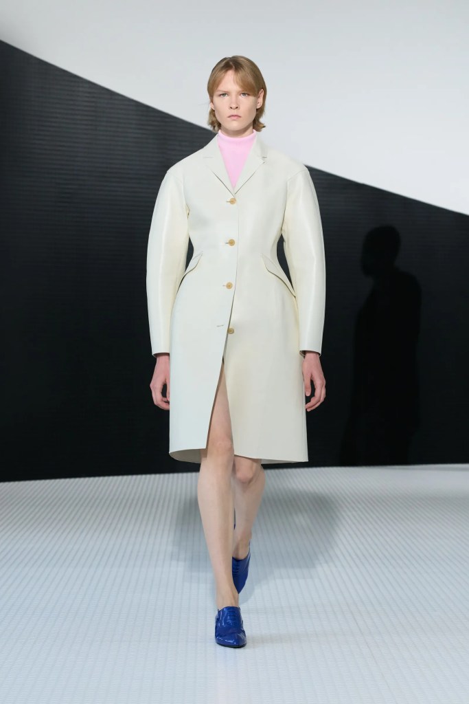
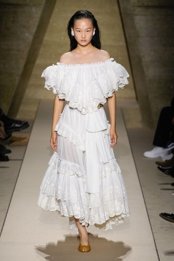
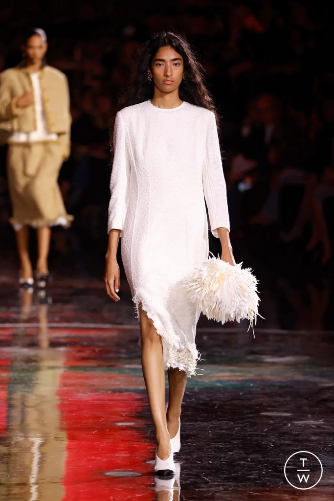
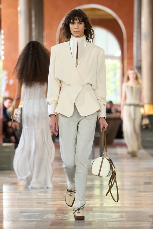
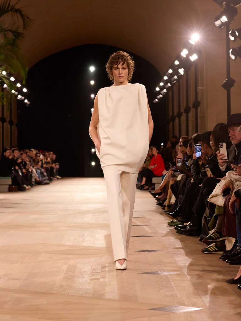
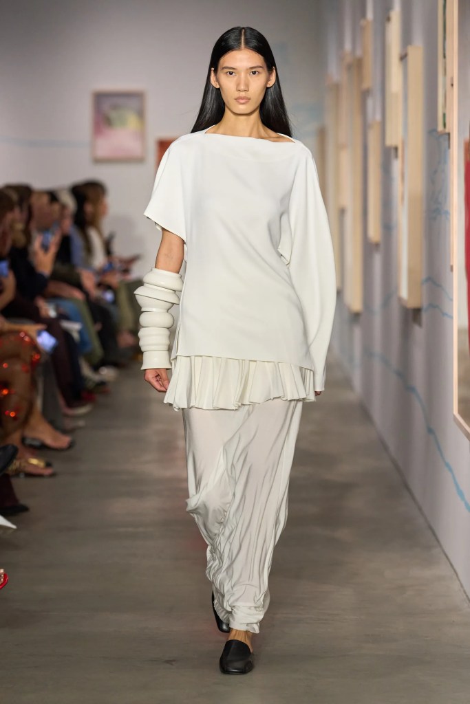
Pantone rarely chooses an obvious colour — it chooses a state of mind. For 2026, and for the first time since initiating this tradition in 1999, it selects white as its Colour of the Year. Not a “clinical” or sterilised white, but Cloud Dancer: soft, ethereal, almost tactile, conceived to reflect the contemporary need to slow down.
According to Pantone itself, Cloud Dancer symbolises renewal, clarity, and purification, but also a collective desire for space — mental, visual, emotional. A colour that doesn’t impose a narrative, but rather enables one. A chromatic reset in an era saturated with stimulus.
In Fashion, this choice arrives at a moment when minimalism is breathing deeply again. Natural fabrics, pared-back silhouettes, textures that reveal light. White, far from being “neutral”, becomes a quiet statement: the elegance of someone who doesn’t need noise.
In lifestyle and design, white takes the form of calmer environments, objects that invite touch, visual rituals that favour clarity. It is a colour that doesn’t proclaim — it whispers. And perhaps it is precisely that whisper we’ve been needing to hear.
White, in 2026, is not absence. It is discreet presence. It is pause, cleansing, an open horizon.
And if the zeitgeist feels fragmented, accelerated, almost feverish, it makes perfect sense that we turn to a colour that returns us to the essential: light, simplicity, and the promise of a new beginning.

Leave a comment